I couldn’t find a task app simple enough. So I built one.
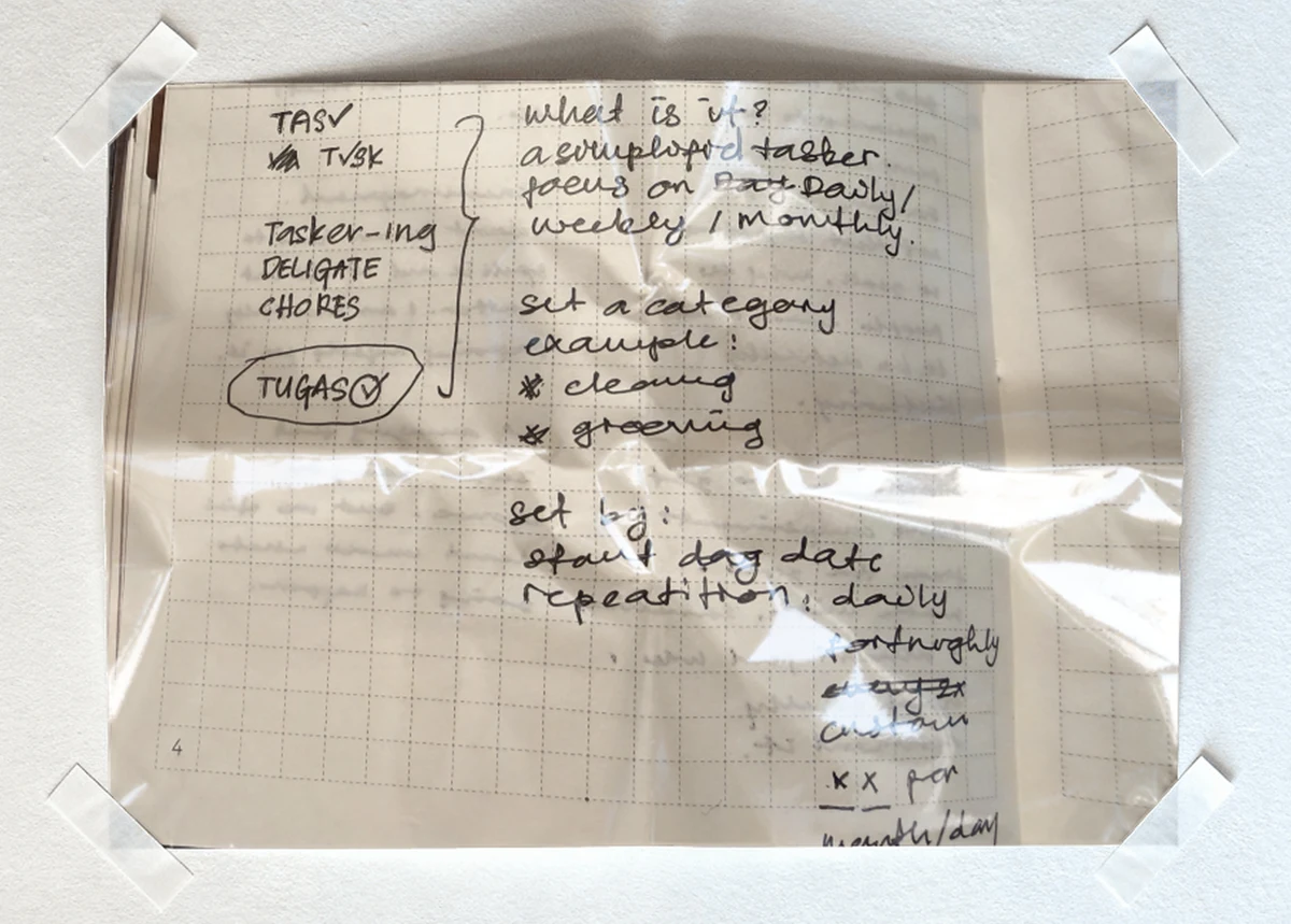
Three bullet points in a note became an app on my phone. Built with an
AI, with care and intention — this is everything in between.
The why
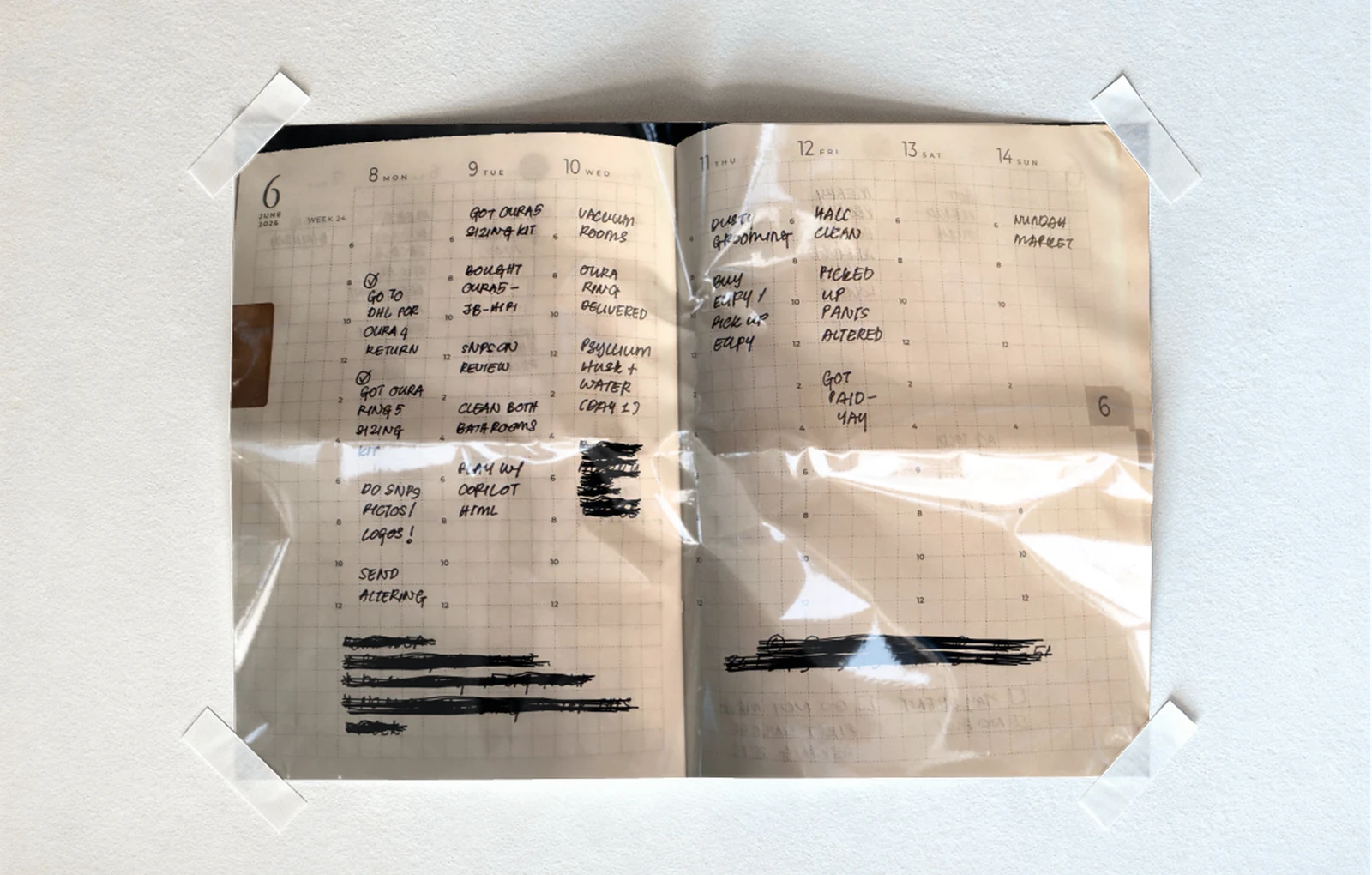
My task system was a weekly paper diary — Monday to Sunday, the
same format every year. It worked, except for the two things paper
can’t do: reset a recurring chore by itself, and remind me.
I’m only human — I forget.
So for weeks I trawled the App Store for a simple app to track
recurring chores. Everything I found wanted something from me first
— a sign-up, a subscription, a paywall in front of the basics
— and every screen was doing too much. Nothing was simple
enough. And there’s one more reason that matters: I’m
dyslexic, and a crowded task list reads like noise — seeing the
whole mountain at once is overwhelming. Seeing only today is calm.
I wanted my diary, digitised — no logins, no distractions, one
week at a time. It didn’t exist, so I built it.
The what
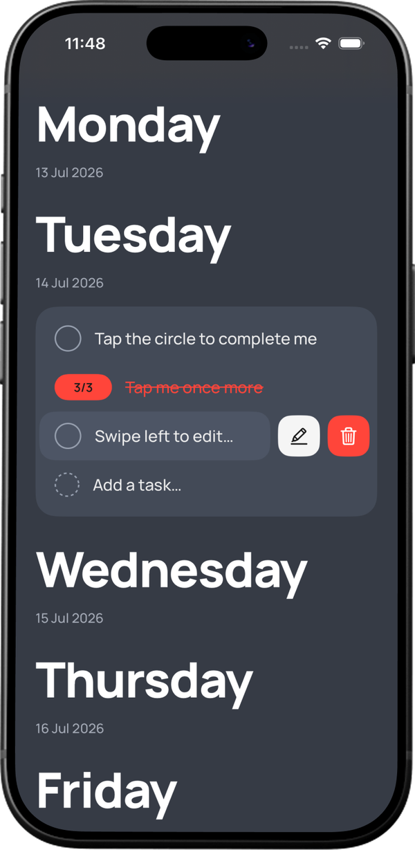
TUGAS is a deliberately tiny task app: one scrolling week, one accent
colour, no accounts. What makes it mine isn’t the feature list
— it’s that every design decision traces back to
something I believe. This is the app’s DNA:
What I believe
The design decision it produced
Overwhelm comes from seeing the whole mountain
Slice the load into daily, sectioned pieces
I plan my life one week at a time (the diary)
Week view, Monday to Sunday; this week only
Paper can’t reset recurring tasks
The recurrence engine — the core of the app
Paper doesn’t speak to me
On my phone, with reminders, always in my pocket
Show me only what’s mine right now
Opens on today; everything else a scroll away
Adding a task shouldn’t be another chore
A ghost “Add a task…” row — instant capture, no friction
My dyslexic brain needs less noise
One accent colour, big day headers, one task = one line
Chores aren’t deep — don’t make them deep
No accounts, no projects, no prep; set and forget
I don’t want stress to take away something I enjoy
Quiet UI; no streaks, no guilt, no gamified pressure
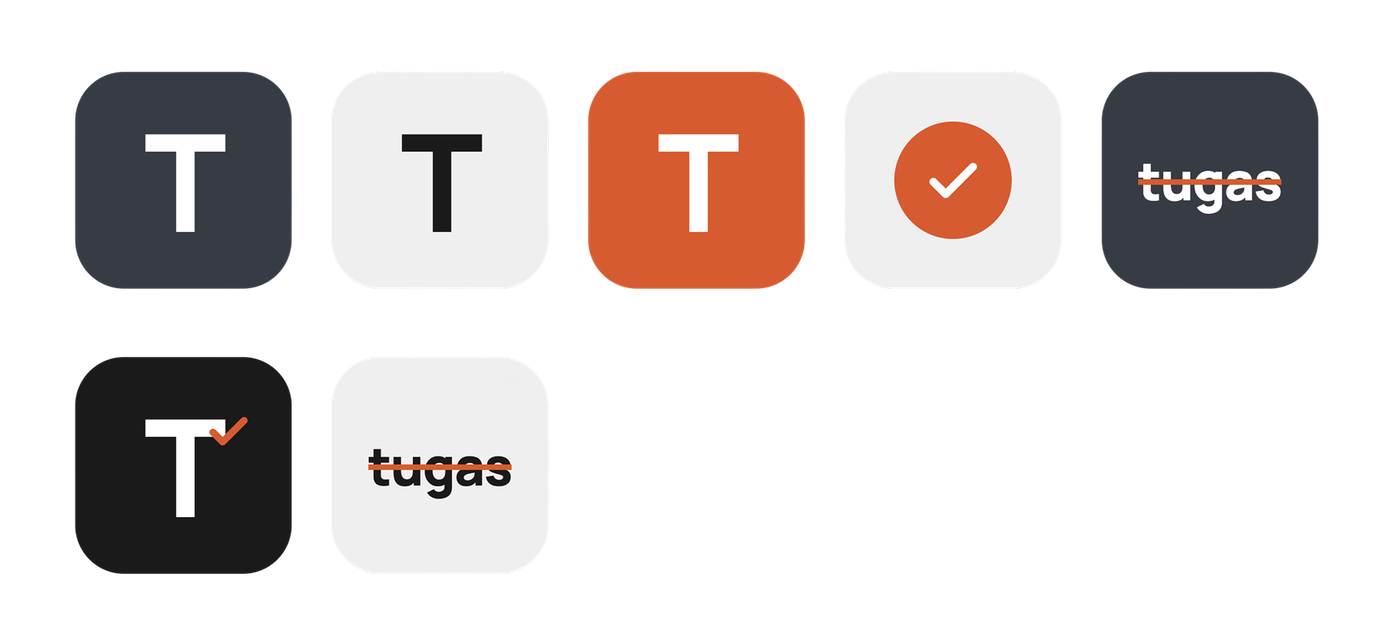
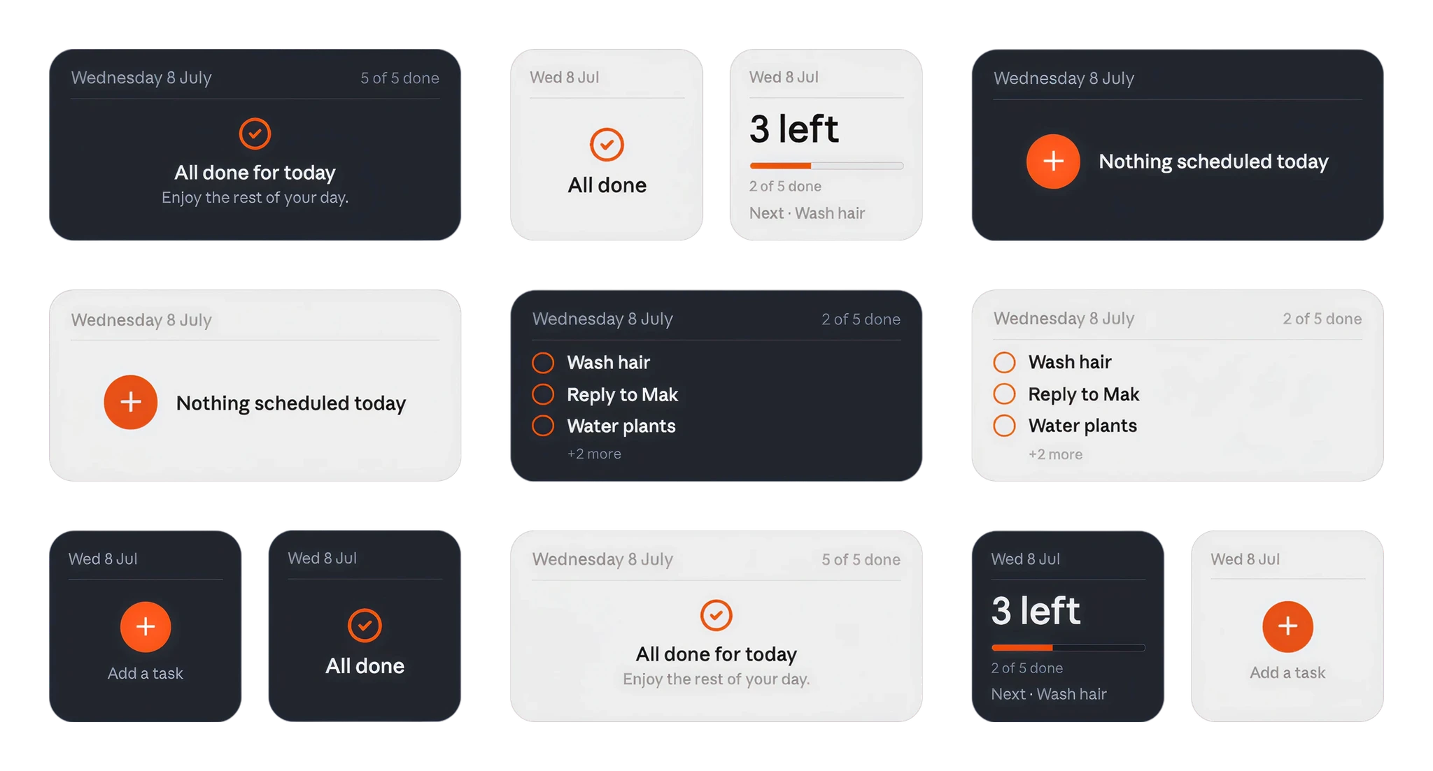
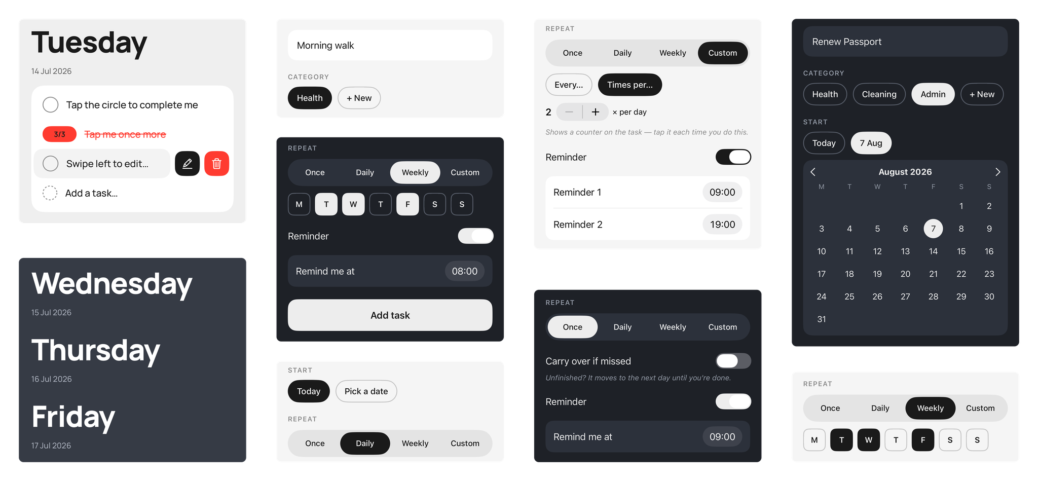
The pieces of TUGAS: cards, chips, toggles — one accent
colour, nothing extra.
The how
Everything here ran the same loop: brief → design
→ build → verify → ship → document.
Honestly? Never as one clean pass — the loop ran dozens of
times, in small pieces. Six beats, each with a receipt and
something you can take with you.
Brief
The questions found what the bullets hid.
TUGAS started as three bullet points: add a task, give it a category, make it repeat. Instead of building that, we interrogated it — one question at a time. What happens to an unfinished task at midnight? What does “every 2 days” mean when you tick it late? The three bullets were hiding at least six decisions I hadn’t made yet.
3 bullets in → 6+ hidden decisions found before anything was built
Brief: three bullet points became a real spec, one question at a time.
Design
The AI shows options. I keep the pen.
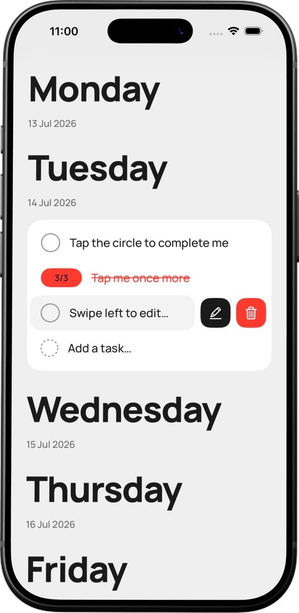
Nothing went straight to real code. I asked for quick throwaway versions first — cheap to make, cheap to bin. When the task-row swipe looked rough on my actual phone, I had the AI mock up six different fixes to compare… then drew my own seventh. That’s the one that shipped.
Design: rounds of options explored cheaply — the final call stayed mine.
Build
Small pieces, each proven before the next.
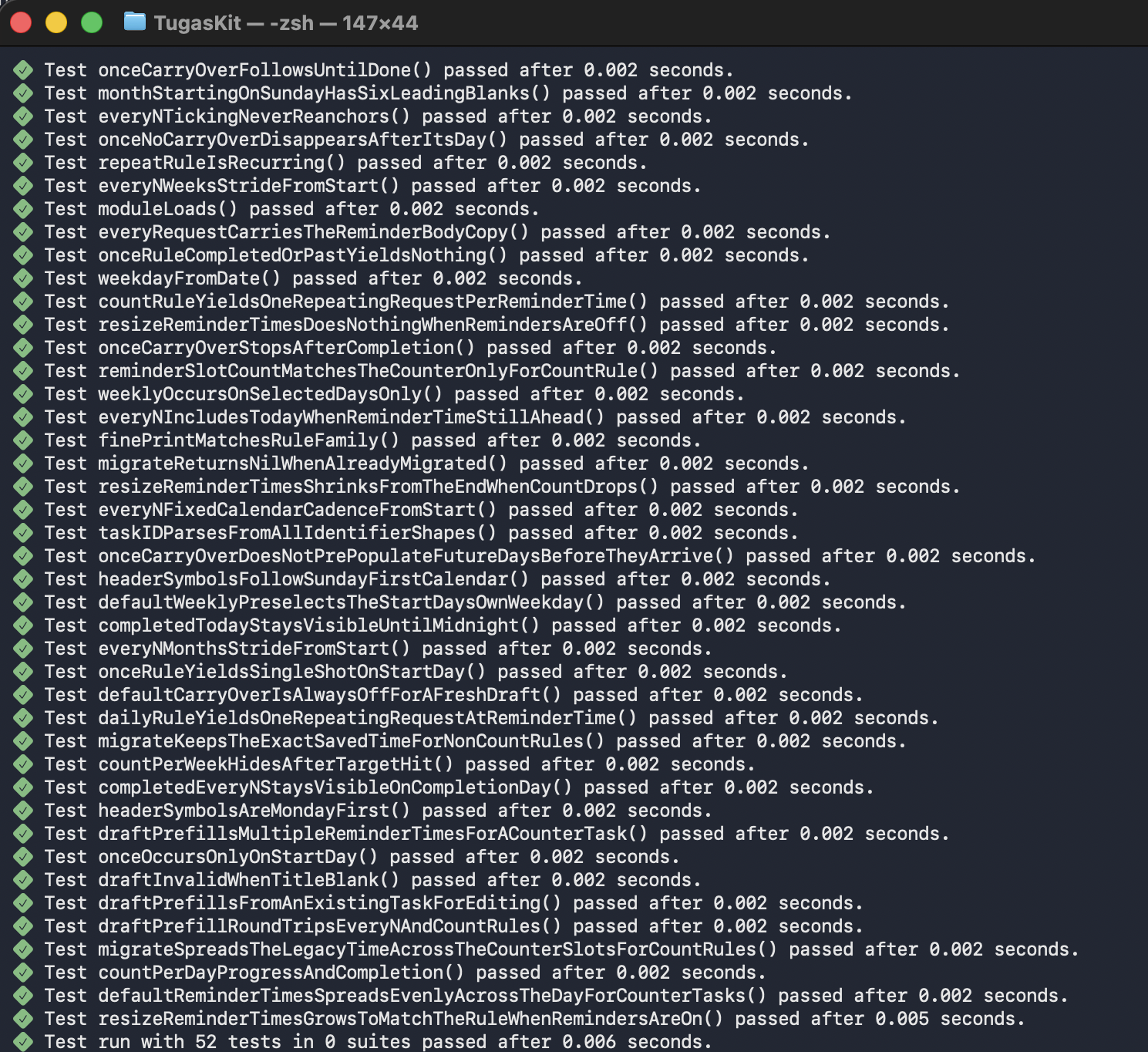
The app grew in small, reviewed steps — never one big leap. The trickiest part, the rules for what happens to a repeating task at midnight, was written and tested before a single screen existed. Today 50 automated checks re-prove those rules every time anything changes. On the busiest day, five improved versions of the app shipped between morning and night.
50 automated checks · five builds shipped in one day
Build: small batches, always verified — 50 checks, five builds in a day.
Verify
No green test, no upload.
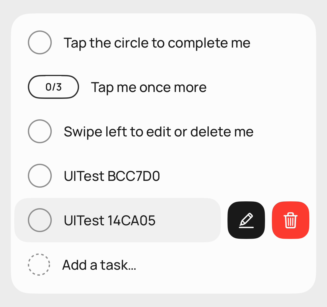
Build 7 shipped with two buttons that looked perfect and did nothing — every check had passed except the one that mattered: actually tapping them. That failure became a rule. Now a simulated finger taps through the real app — swipes, edits, deletes — before any build is allowed out the door.
The rule itself: no green test, no upload
Verify: a shipped failure, turned into a permanent gate.
Ship
Shipping is a skill you practise.
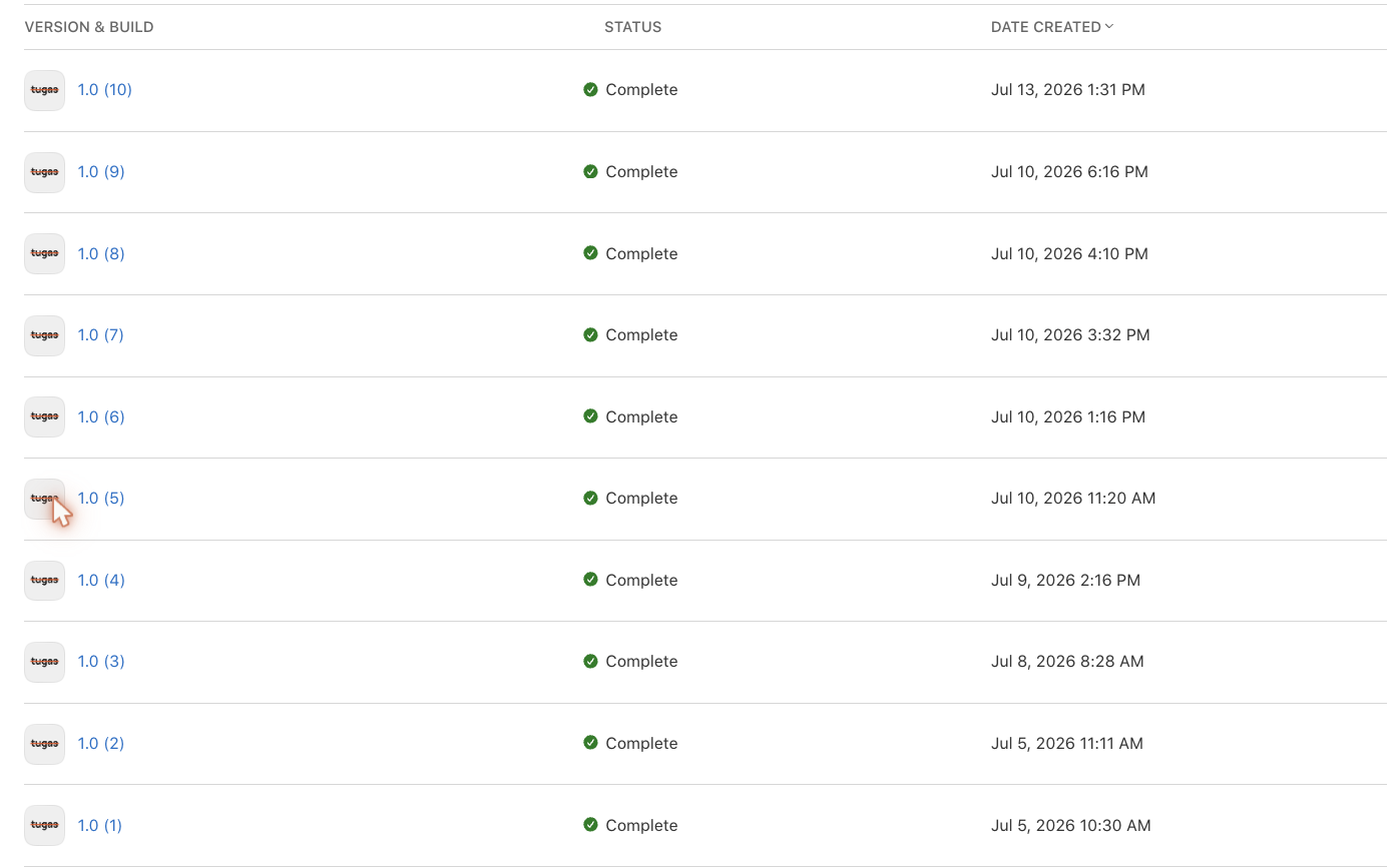
The first release took a whole evening of certificates and ceremony. By the ninth, releasing was routine. Nine real versions went to my iPhone through TestFlight — Apple’s channel for pre-release apps — in six days, each one a little better than the last.
Build timeline: 1.0 (1) → 1.0 (9), six days
Ship: nine real releases in six days — routine, not ceremony.
Document
Write the loop down — it compounds.
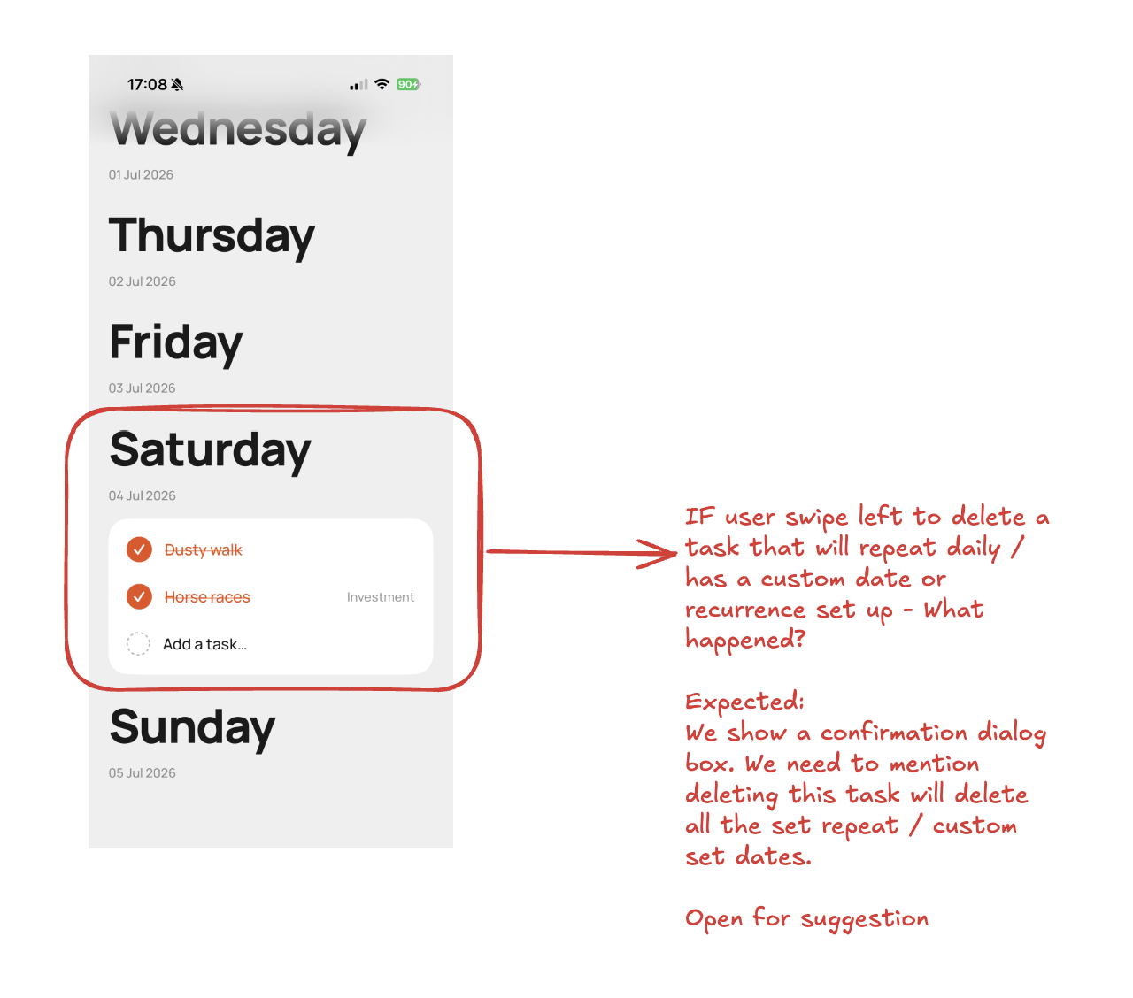
Every session starts where the last one ended, because everything is written down: decisions, feedback, what worked. My feedback measurably improved on the record. Round 1’s “the calendar is incorrect” wasted a whole round — the fix matched the words, not what I meant. By round 3 I was sending annotated screenshots of current vs desired, and fixes landed in one shot. The playbook now has a rule at the top: show the destination, not just the problem.
Document: a real feedback sketch — the destination drawn, not just the problem circled.
The outcome
TUGAS shipped. It’s on my phone, on TestFlight, and it runs my
week — used daily by the person it was built for. But the app
is only half the outcome. The other half is what this practice did
to the practice itself. In March I ran my first AI-built project,
A Designer’s AI Field
Notes; TUGAS, four months later, is the test of what stuck:
Skill
March · first project
July · TUGAS
Starting
No plan, a barely-formed prompt
A validated spec and a step-by-step build plan before any code
Giving context
Light briefs, content scattered elsewhere
A living spec, a project log, a written brief for every round of work
Asking
A prompt, barely formed
Self-contained briefs — each fix scoped with its cause and how to check it
Giving feedback
Discovered the hard way that feedback is a skill
Sketches, reference images, real-phone screenshots of current vs desired — one-shot fixes
Designing
Rebuilt my design file properly only after a messy first go
Design-system-first from day one; binned a weak attempt cheaply
UX judgement
Content-driven, layout-led
Opinionated defaults, minimalism with reasons, empty-state thinking
Directing the code
Could read it well enough to follow along
Directed the architecture; caught fixes that solved the wrong problem
Verifying
Mostly by eye
A screenshot for every fix, 50 automated checks, always run the real thing
Rigour
First real app, learning the tools
The tricky logic written as tested rules before any screens existed
Shipped much further — a real iPhone, TestFlight — but backed up later. Still working on that one.
And this is the part that compounds.
One more thing. Not long before TUGAS, Satya
Nadella wrote that the real opportunity in AI isn’t picking the
best model — it’s “building a learning loop on top
of models where human capital and token capital compound.” In
plain words: your judgement, plus a way of working with AI that gets
better every round. That’s what this page is. TUGAS is just
the app it produced.